Saturday, 29 November 2008
Friday, 28 November 2008
MANCHESTER TRIP
Wednesday, 26 November 2008
100 PHOTOGRAPHS

I have chosen Urban Decay as the concept for this brief. The area where I live in Leeds suffers from a severe case of Urban Decay.

Urban decay is a process by which a city, or a part of a city, falls into a state of disrepair. It is characterized by depopulation, economic restructuring, property abandonment, high unemployment, fragmented families, political disenfranchisement, crime, and desolate and unfriendly urban landscapes.


Sunday, 23 November 2008
ALPHABET SOUP AND ILLUSTRATOR WORK

The alphabet I created for Craig is a mixture of type and symbols. It turned out ok, however, the comb and mustache didn't work as combinations with type. The glasses did though were the letterforms look like ice in a drink. The overall composition looks good because of the variety and styling and it captures his party attitude.


Friday, 21 November 2008


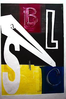
I hadn't done mono or screen printing for a while and forget the variety of possibilities, quality of colour and finish you can achieve. Tuition at the print room was good if a little obsessive at times and the attitude was questionable but overall very good and learned a great deal for future work.


WHAT IS... RED
The 10 pieces I developed for this were based on the theme of blood and death. It turned out to be a nightmare to align the black and the red when screen printing. The drawings were poor in quality and needed more work and development, but it answered the brief correctly and other students liked the finished work.


NO NEWS IS GOOD NEWS


Jamie Oliver would like this project. I colour photocopied the envelopes to save money but the stickers were printed onto sticky backed paper and are water resistant or so James says. I kept it simple because I didn't fancy spending hours constructing the envelopes and focused mainly on the visual design which is a combination of illustrations and type. I chose yellow and purple because I wanted it to stand out but still compliment. I had used red and yellow for the previous brief but it was too intense so changed for this brief. I did use the same Pantone colours for the stickers, envelope and mail list but the printers in the Mac suites don't have much colour range compared to digital print which means the purples are different, not good.

I used this project mainly to develop what I learned in the Illustrator workshops. I don't really like the work I made partly due to not developing enough ideas and learning the software, but it answered the brief and I Iearned more skills.

Thursday, 20 November 2008
PAINT, EXHIBITIONS AND OTHER INTERESTING THINGS
Tuesday, 18 November 2008
Sunday, 16 November 2008
Friday, 14 November 2008
Wednesday, 12 November 2008
SALT - FAST FOOD

The theme for the project I am working on at the moment is unhealthy living relating to a poor diet. My main topic is SALT. Fast food is a big topic within this subject, below is information and facts I have gathered:
Eating too much salt can cause high blood pressure. High blood pressure can cause heart disease and other health problems.
University of Illinois (2008)
How much sodium is too much?
Health experts recommend 1,100 - 3,300 mg of sodium per day for healthy adults. Most people eat 2,300 to 6,900 mg per day. This is too much sodium. Some people are salt/sodium sensitive. African Americans, Hispanics, and obese individuals are especially sensitive to salt.
Controlling the salt in your daily diet can reduce the risk of high blood pressure. Check your blood pressure often. If it is high, see a doctor. High blood pressure is a reading of more than 140/85. If your blood pressure is normal, keep it that way. Exercising, eating less salt and fat, and keeping your weight down will help your blood pressure stay normal.
Salt/sodium can hide in many foods. One teaspoon of salt contains 2,000 mg of sodium. The following suggestions can help lower salt intakes:
Eat fewer salty snacks such as potato chips, nuts, cheese and pretzels.
Read the "Nutrition Facts" panel on food labels to see how much sodium you are eating.
Read the label. Look for the words, low-salt or reduced-sodium on products to replace those with high salt.
Use fresh or frozen vegetables instead of high sodium canned
Avoid pickled products like sauerkraut, deli meats, sausages and canned fish.
Use herbs and spices like garlic powder, thyme, oregano, and basil to flavor food and use less salt. Season meat with lemon juice, bay leaf, crushed red pepper and rosemary. Season chicken with sage, seasoned vinegar and ginger.
Limit the use of high-salt soy sauce, meat tenderizers, seasoned salt, and Worcestershire. Look for salt-free herb blends for cooking.
Many people have learned to reduce salt in their diets without missing the salty taste. You can too. Cut back on salt slowly, allowing time for your tastebuds to adjust. Replace the salty taste with another flavor.
Sunday, 9 November 2008
VISUAL LANGUAGE
Subscribe to:
Comments (Atom)


